I have some trouble with the positioning of my mobile menu. It seems that chrome has a small shift from 1px then in the other browser and i don't know why. as well firefox looks in a specific width range good, but not overall. i use bootstrap and bootstrap use noramlize.css to reset the elements.
i prepared it on jsfiddle and tried to figure out what the problem is but was not able to.
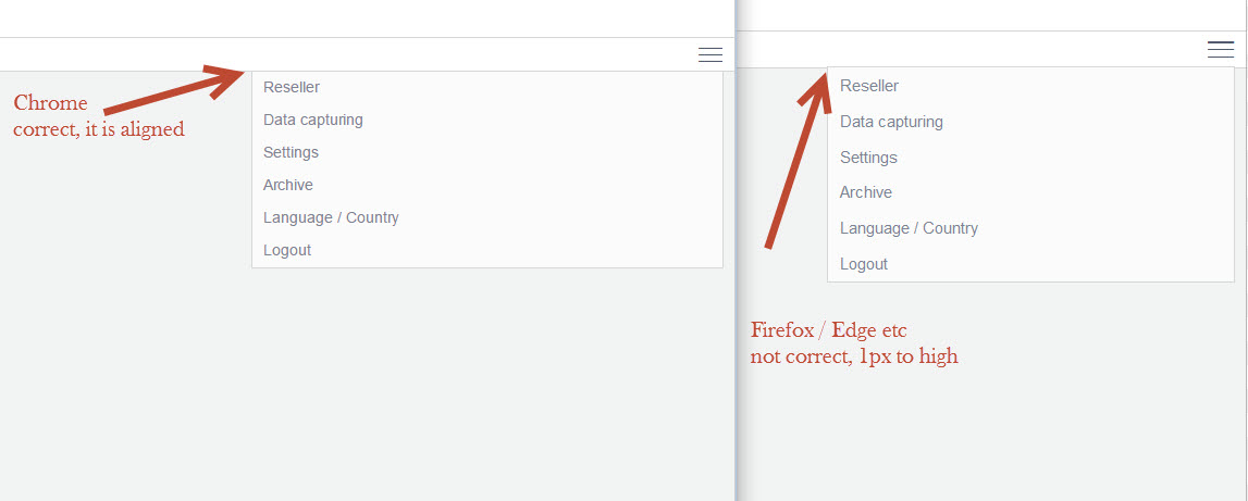
here you can better see what i mean:
i use the normal navbar from bootsrap:
HTML
<div class="navbar-header">
                        <button type="button" class="navbar-toggle" data-toggle="collapse" data-target="#top-nav" aria-expanded="true">
                            <span class="sr-only">Toggle navigation</span>
                            <span class="hamburger-icon"></span>
                        </button>
                        <div style="" aria-expanded="true" class="navbar-collapse collapse in" id="top-nav">
                            <ul class="nav navbar-nav nav-top">
                                <li>
                                    <a class="dropdown-btn small" type="button" href="reseller.php">
                                        <span class="icon reseller-icon"></span><span class="text">Reseller</span>
                                    </a>
                                </li>
                                <li>
                                    <a class="dropdown-btn small" type="button" href="first_step.php">
                                        <span class="icon wizard-icon"></span><span class="text">Data capturing</span>
                                    </a>
                                </li>
                                <li>
                                     <a class="dropdown-btn small" type="button" href="settings.php">
                                        <span class="icon settings-icon"></span><span class="text">Settings</span>
                                    </a>
                                </li>
                                <li>
                                    <a class="dropdown-btn small" type="button" href="archive.php">
                                        <span class="icon archive-icon"></span><span class="text">Archive</span>
                                    </a>
                                </li>
                                <li>
                                    <a class="modalbox dropdown-btn small" href="#modalbox-language-country">
                                        <span class="icon search-icon"></span><span class="text">Language / Country</span>
                                    </a>
                                </li>
                                <li class="visible-xs">
                                    <a class="dropdown-btn small" href="#">
                                        <span class="icon"></span><span class="text">Logout</span>
                                    </a>
                                </li>
                            </ul>
                        </div>
                    </div>
Due the css is not that small, it may be better to see it directly on jsfiddle.
Here is my code: https://jsfiddle.net/nm7b8jw2/5/
Thanks for any help
Aucun commentaire:
Enregistrer un commentaire